


About
Projects
Illustration
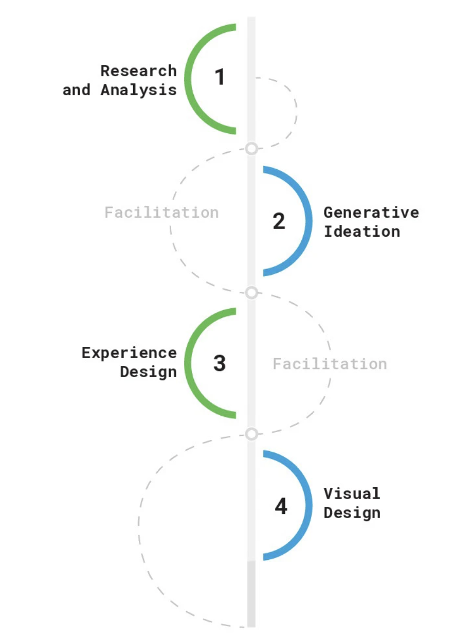
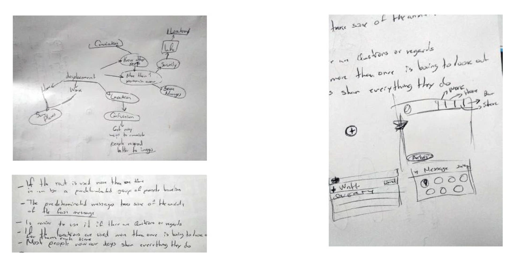
Ideation & Synthesis
After collecting data, I mapped out ideas to identify pain points and opportunities. I explored message behavior patterns, key user frustrations, and interface gaps. This phase included brainstorming, concept sketching, and early solution mapping.Key Activities:
- Quick idea mapping
- Paper sketches of potential solutions
- Association of interface behaviors with context (location, urgency, user routine)
User Personas
UX/UI Designer (Sole designer for this concept) Responsible for user flow mapping, wireframing, high-fidelity UI design, and prototyping Led the design process from concept ideation to final mockups Focused on improving usability, engagement, and content hierarchy
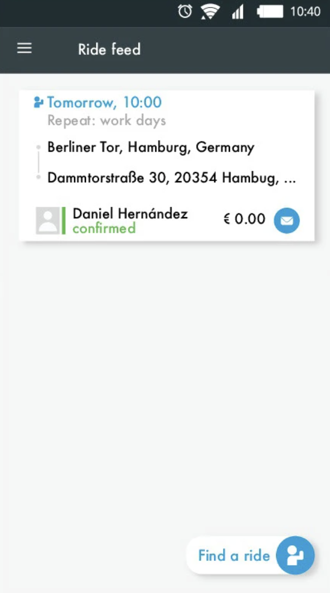
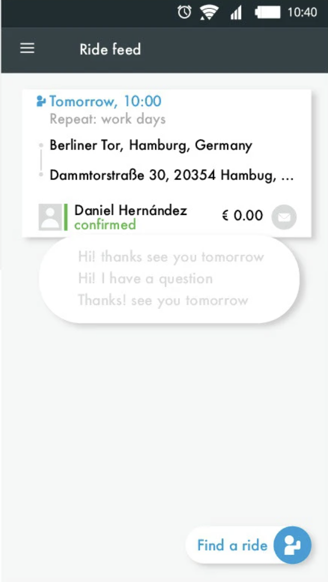
Prototyping Phase (Teaser)
With a clearer picture of user needs and frustrations, I translated these insights into actionable design solutions. The upcoming prototyping phase includes:
- Chat UI with predefined quick messages
- Context-aware message suggestions (based on time/location history)
- Enhanced message status indicators
- A redesigned media sharing flow with download confirmation
Prototyping & UI Design
Design GoalsBased on our research, the design aimed to:
- Streamline quick communication on the go
- Provide visual feedback and message control
- Enhance context-awareness through smart suggestions
- Improve usability of shared content (e.g., images, locations)
Wireframes & Early Concepts
I translated ideas into low-fidelity wireframes to test layout and hierarchy. These sketches helped evaluate flows before jumping into high-fidelity visuals.
Key wireframe features:
- Smart suggestion bar with recent or frequent phrases
- Visual feedback for message status (e.g., sent, failed)
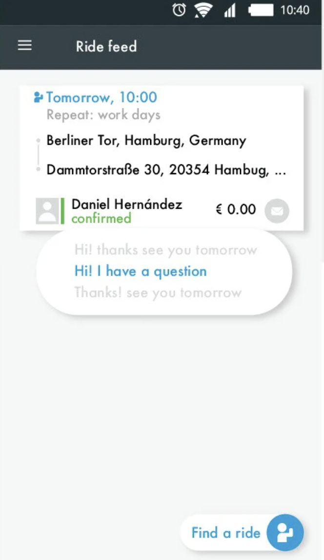
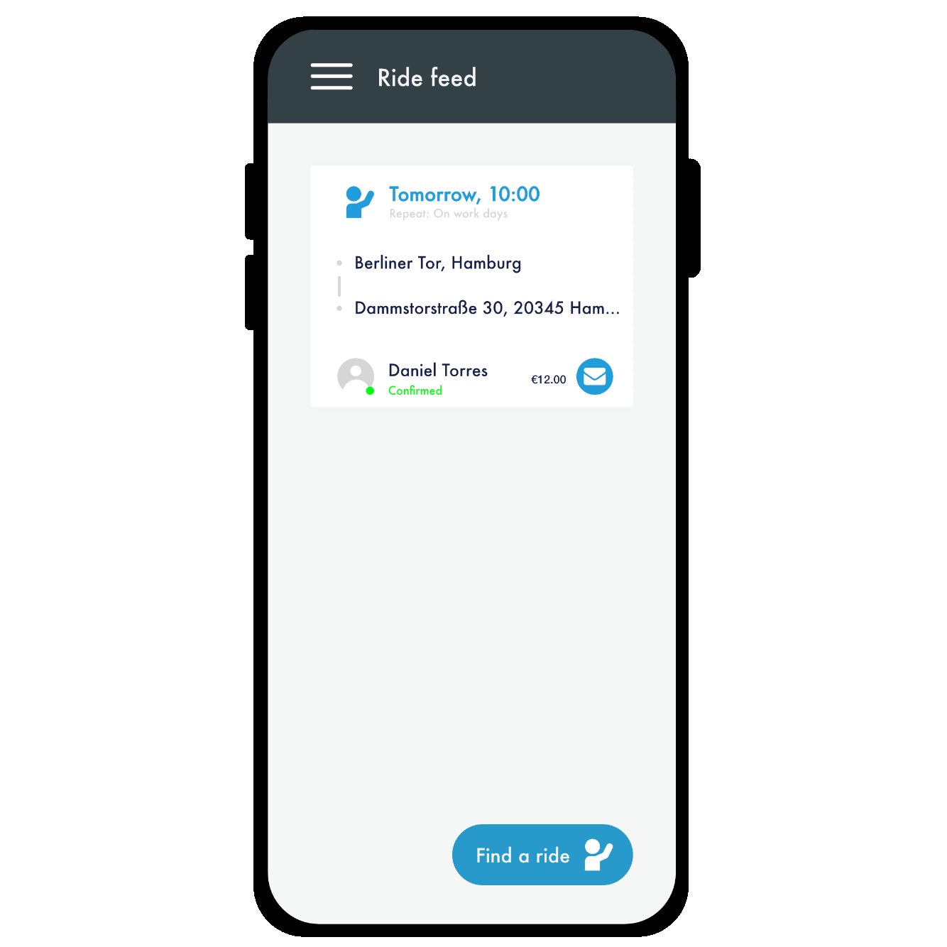
- Contextual quick replies (“I’m here,” “5 min away,” etc.)
- Toggle for message history by ride or contact
UI Design System
Once flows were tested, I built a UI kit to ensure consistency and speed up iteration. The system included:
- Reusable components (chat bubbles, input fields, status icons)
- Color-coded message states (sent, failed, deleted)
- Accessibility-first typography and contrast
- Modular layout for mobile responsiveness
Interactive Prototype
I created a clickable prototype in Figma to validate the design with users.The prototype allowed users to:
- Send and delete messages
- Preview a shared location
- Use quick replies and receive intelligent suggestions
- Download images directly from chat
Feedback was gathered via quick usability tests with target users, using Maze and direct sessions.
Result & Learnings
User testing revealed a 30% faster message completion time and greater satisfaction with the smart suggestion feature. Key takeaways:
- Users appreciated auto-suggestions tied to routines
- Status indicators built trust
- Keeping chat simple but smart improved engagement
Outcome
The final design provided a chat interface that felt intuitive, reliable, and context-aware—supporting real-time decisions in transit or location-based scenarios. The solution bridged the gap between communication and logistics, all while keeping users in control.

Wunder Mobility Chat Interface Optimisation
The main objective was to explore creative ways to improve the chat interface, keeping in mind the app's primary function: location sharing and ride coordination.

Julia, 28 – Urban Commuter “I just want to hit a button and say ‘I’m here’ — I don’t have time to type.”
- Wants to send quick updates in transit
- Needs saved or predictive messages

Fatima, 35 – Working Mom “The app should remember where I usually go. I don’t want to repeat myself.”
- Wants message history by ride or location
- Seeks convenience through automation


About
Projects
Illustration
Ideation & Synthesis
After collecting data, I mapped out ideas to identify pain points and opportunities. I explored message behavior patterns, key user frustrations, and interface gaps. This phase included brainstorming, concept sketching, and early solution mapping.Key Activities:
- Quick idea mapping
- Paper sketches of potential solutions
- Association of interface behaviors with context (location, urgency, user routine)
User Personas
UX/UI Designer (Sole designer for this concept) Responsible for user flow mapping, wireframing, high-fidelity UI design, and prototyping Led the design process from concept ideation to final mockups Focused on improving usability, engagement, and content hierarchy
Prototyping Phase (Teaser)
With a clearer picture of user needs and frustrations, I translated these insights into actionable design solutions. The upcoming prototyping phase includes:
- Chat UI with predefined quick messages
- Context-aware message suggestions (based on time/location history)
- Enhanced message status indicators
- A redesigned media sharing flow with download confirmation
Prototyping & UI Design
Design GoalsBased on our research, the design aimed to:
- Streamline quick communication on the go
- Provide visual feedback and message control
- Enhance context-awareness through smart suggestions
- Improve usability of shared content (e.g., images, locations)
Wireframes & Early Concepts
I translated ideas into low-fidelity wireframes to test layout and hierarchy. These sketches helped evaluate flows before jumping into high-fidelity visuals.
Key wireframe features:
- Smart suggestion bar with recent or frequent phrases
- Visual feedback for message status (e.g., sent, failed)
- Contextual quick replies (“I’m here,” “5 min away,” etc.)
- Toggle for message history by ride or contact
UI Design System
Once flows were tested, I built a UI kit to ensure consistency and speed up iteration. The system included:
- Reusable components (chat bubbles, input fields, status icons)
- Color-coded message states (sent, failed, deleted)
- Accessibility-first typography and contrast
- Modular layout for mobile responsiveness
Interactive Prototype
I created a clickable prototype in Figma to validate the design with users.The prototype allowed users to:
- Send and delete messages
- Preview a shared location
- Use quick replies and receive intelligent suggestions
- Download images directly from chat
Feedback was gathered via quick usability tests with target users, using Maze and direct sessions.
Result & Learnings
User testing revealed a 30% faster message completion time and greater satisfaction with the smart suggestion feature. Key takeaways:
- Users appreciated auto-suggestions tied to routines
- Status indicators built trust
- Keeping chat simple but smart improved engagement
Outcome
The final design provided a chat interface that felt intuitive, reliable, and context-aware—supporting real-time decisions in transit or location-based scenarios. The solution bridged the gap between communication and logistics, all while keeping users in control.
Wunder Mobility Chat Interface Optimisation
The main objective was to explore creative ways to improve the chat interface, keeping in mind the app's primary function: location sharing and ride coordination.
Julia, 28 – Urban Commuter “I just want to hit a button and say ‘I’m here’ — I don’t have time to type.”
- Wants to send quick updates in transit
- Needs saved or predictive messages
Fatima, 35 – Working Mom “The app should remember where I usually go. I don’t want to repeat myself.”
- Wants message history by ride or location
- Seeks convenience through automation