


About
Projects
Illustration

SVCV UI Design Optimization
Optimisation to Enhance Human Interaction
The Verification Service for Voter ID Data Microsite is an informational website designed to enhance understanding of this service and its processes. As part of its redesign, we focused on improving the visual experience to ensure better usability and accessibility, making the information clearer and more engaging.
The Challenge: How to Boost Engagement?
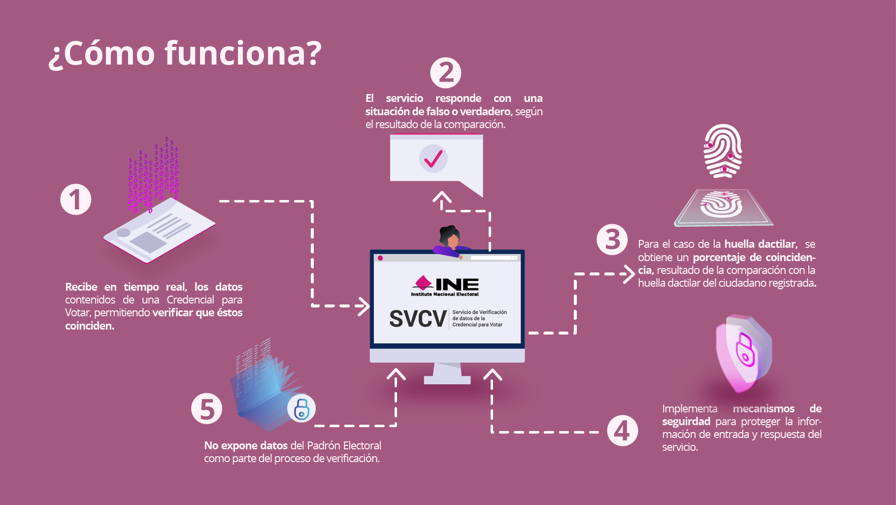
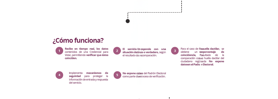
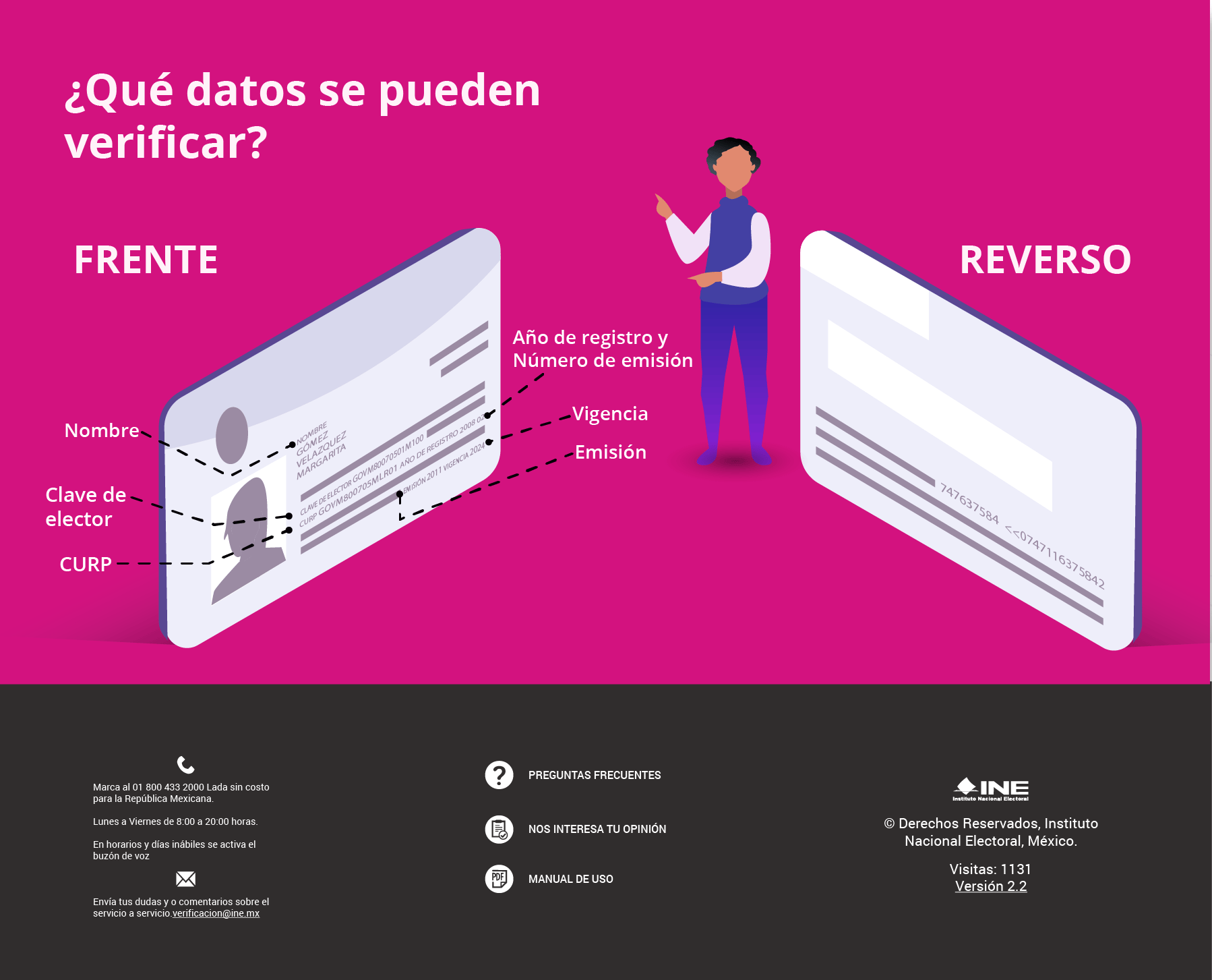
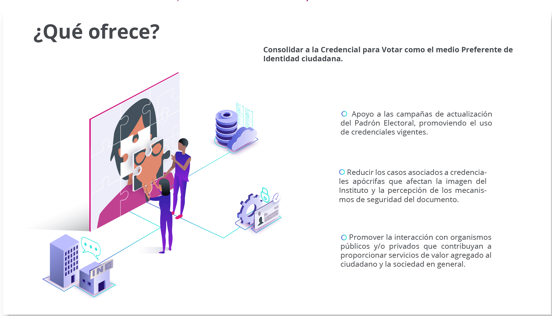
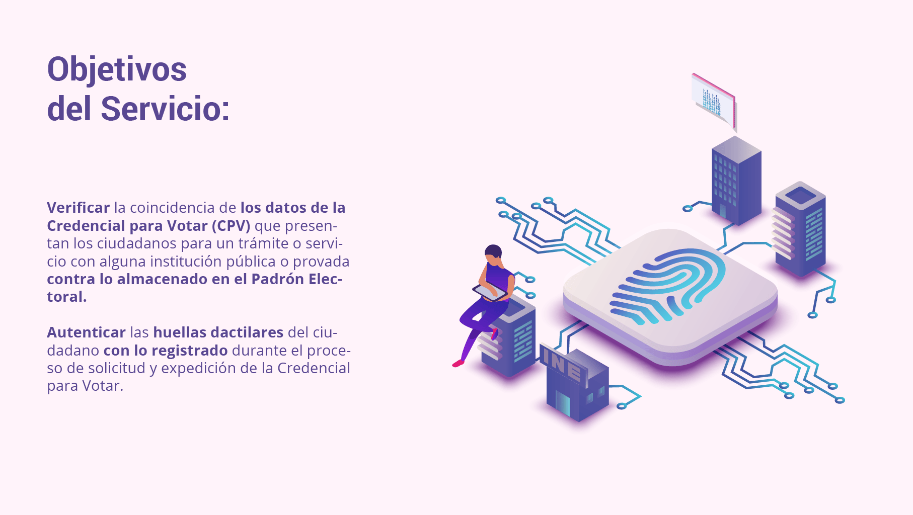
The content on the SVCV page was already clear, but a study revealed that users rarely read it to the end. Our challenge was to present the information in a more engaging and digestible way, ensuring that voters abroad could easily follow every step and receive their documents on time. Given that attention spans are short and infographics improve comprehension, we focused on creating step-by-step illustrations and concise, engaging text—making the process both clear and enjoyable.
Summary:
- Enhance UX Writing: Simplify and clarify the language to improve accessibility and user-friendliness.
- Create Descriptive Illustrations: Transform key content into compelling, informative visuals to enhance comprehension.
- Introduce Interactive Design: Implement interactive elements to boost engagement and improve the user experience.
My role
I created the new look and feel, considering design principles and new trends, while incorporating institutional colors to make the website more appealing.
Additionally, I worked alongside a Product Manager and a Backend Engineer. After reviewing user feedback, we decided to simplify the menu and highlight the key areas that required greater visibility. The creation of wireframes and the first prototype was completed by 2018.
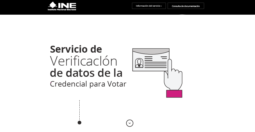
Before
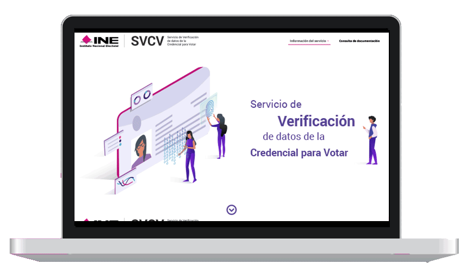
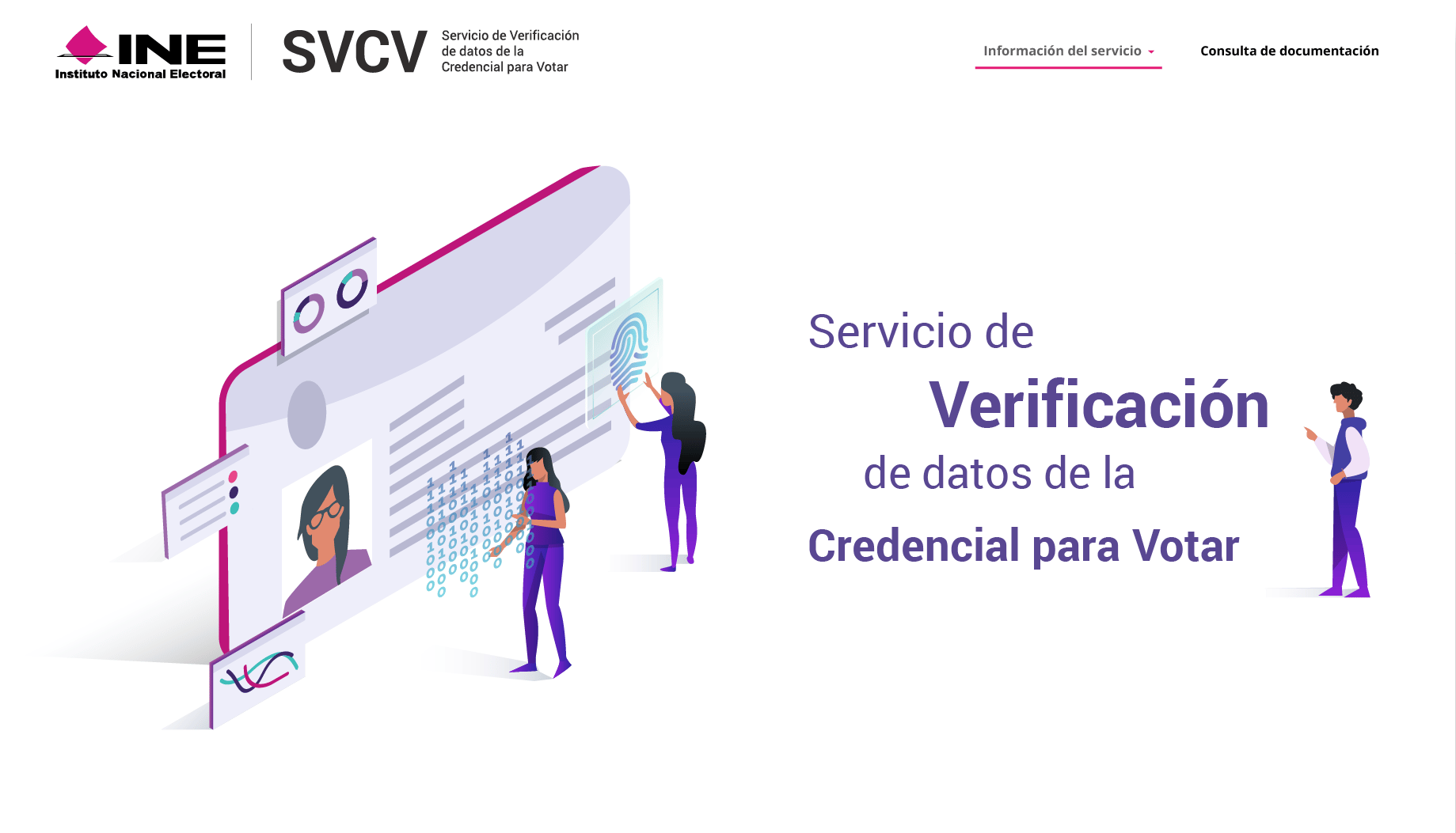
Final Page


About
Projects
Illustration
SVCV UI Design Optimization
Optimisation to Enhance Human Interaction
The Verification Service for Voter ID Data Microsite is an informational website designed to enhance understanding of this service and its processes. As part of its redesign, we focused on improving the visual experience to ensure better usability and accessibility, making the information clearer and more engaging.
The Challenge: How to Boost Engagement?
The content on the SVCV page was already clear, but a study revealed that users rarely read it to the end. Our challenge was to present the information in a more engaging and digestible way, ensuring that voters abroad could easily follow every step and receive their documents on time. Given that attention spans are short and infographics improve comprehension, we focused on creating step-by-step illustrations and concise, engaging text—making the process both clear and enjoyable.
Summary:
- Enhance UX Writing: Simplify and clarify the language to improve accessibility and user-friendliness.
- Create Descriptive Illustrations: Transform key content into compelling, informative visuals to enhance comprehension.
- Introduce Interactive Design: Implement interactive elements to boost engagement and improve the user experience.
My role
I created the new look and feel, considering design principles and new trends, while incorporating institutional colors to make the website more appealing.
Additionally, I worked alongside a Product Manager and a Backend Engineer. After reviewing user feedback, we decided to simplify the menu and highlight the key areas that required greater visibility. The creation of wireframes and the first prototype was completed by 2018.
Before
Final Page