About
Projects
Illustration

DERFE Portal Redesign
Client: DERFE – Dirección Ejecutiva del Registro Federal de ElectoresRole: UX/UI DesignerYear: [Add Year]Tools: Figma, Adobe Illustrator, Maze (optional if tested), Miro I was tasked with redesigning DERFE’s internal platform — a government portal used for monitoring digital services — to improve usability, simplify navigation, and bring a modern interface aligned with accessibility standards.
The Challenge: How to refresh the site?
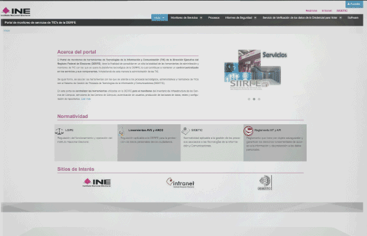
The main page features three separate menus, each with its own set of options and information. While the goal is to offer a variety of resources, the current structure can make navigation difficult for users. The portal description, although informative, uses complex language that might be hard to understand for some users.
Simplifying this text and restructuring the menus could make the portal more user-friendly. Providing clearer, more concise explanations and reducing the number of menus would improve accessibility, helping users find the information they need more easily and quickly. Streamlining both the language and navigation would enhance the overall user experience.
My role
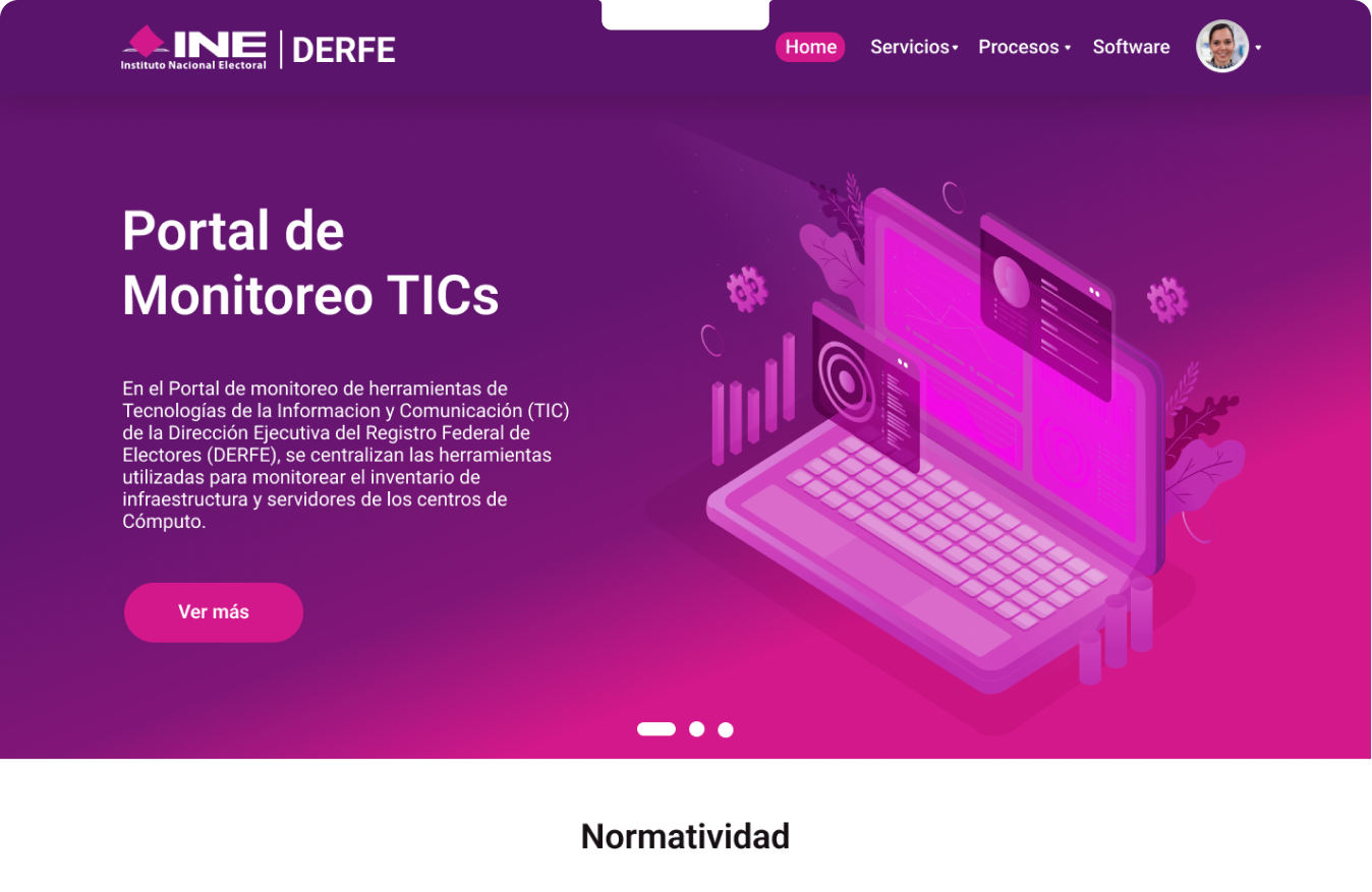
I created the new look and feel, considering design principles and new trends, while incorporating institutional colors to make the website more appealing. Additionally, I worked alongside a Product Manager and a Backend Engineer. After reviewing user feedback, we decided to simplify the menu and highlight the key areas that required greater visibility. The creation of wireframes and the first prototype was completed by 2018.
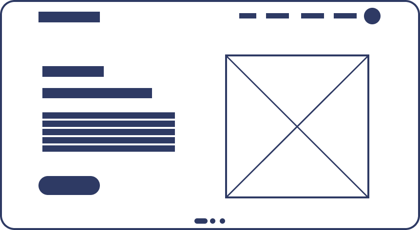
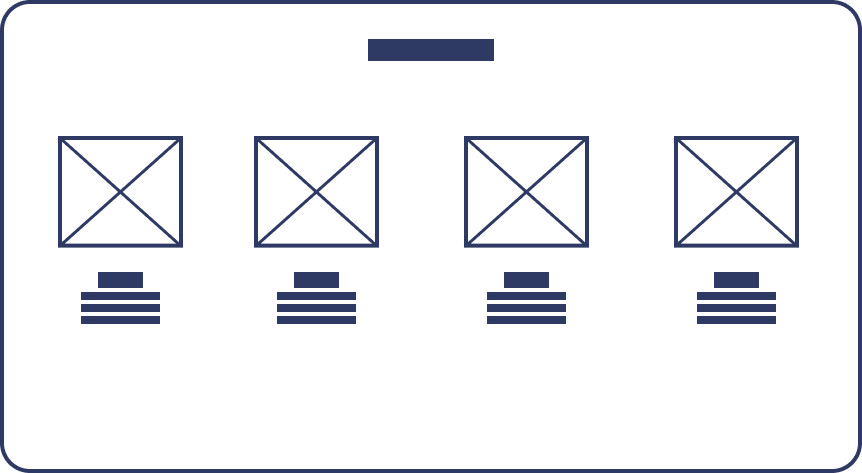
Wireframe
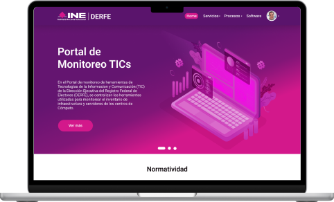
Final Result
Summary:
- Enhance UX Text: Simplify and clarify the language to make the content more accessible and user-friendly.
- Reorganize Information: Streamline the structure of the content for better flow and easier navigation.
- Introduce Interactive Design: Implement interactive elements to engage users and improve the overall experience.
Due to contractual obligations, this screen has been blurred, and certain information will not be displayed.


About
Projects
Illustration
DERFE Portal Redesign
Client: DERFE – Dirección Ejecutiva del Registro Federal de ElectoresRole: UX/UI DesignerYear: [Add Year]Tools: Figma, Adobe Illustrator, Maze (optional if tested), Miro I was tasked with redesigning DERFE’s internal platform — a government portal used for monitoring digital services — to improve usability, simplify navigation, and bring a modern interface aligned with accessibility standards.
The Challenge: How to refresh the site?
The main page features three separate menus, each with its own set of options and information. While the goal is to offer a variety of resources, the current structure can make navigation difficult for users. The portal description, although informative, uses complex language that might be hard to understand for some users.
Simplifying this text and restructuring the menus could make the portal more user-friendly. Providing clearer, more concise explanations and reducing the number of menus would improve accessibility, helping users find the information they need more easily and quickly. Streamlining both the language and navigation would enhance the overall user experience.
My role
I created the new look and feel, considering design principles and new trends, while incorporating institutional colors to make the website more appealing. Additionally, I worked alongside a Product Manager and a Backend Engineer. After reviewing user feedback, we decided to simplify the menu and highlight the key areas that required greater visibility. The creation of wireframes and the first prototype was completed by 2018.
Wireframe
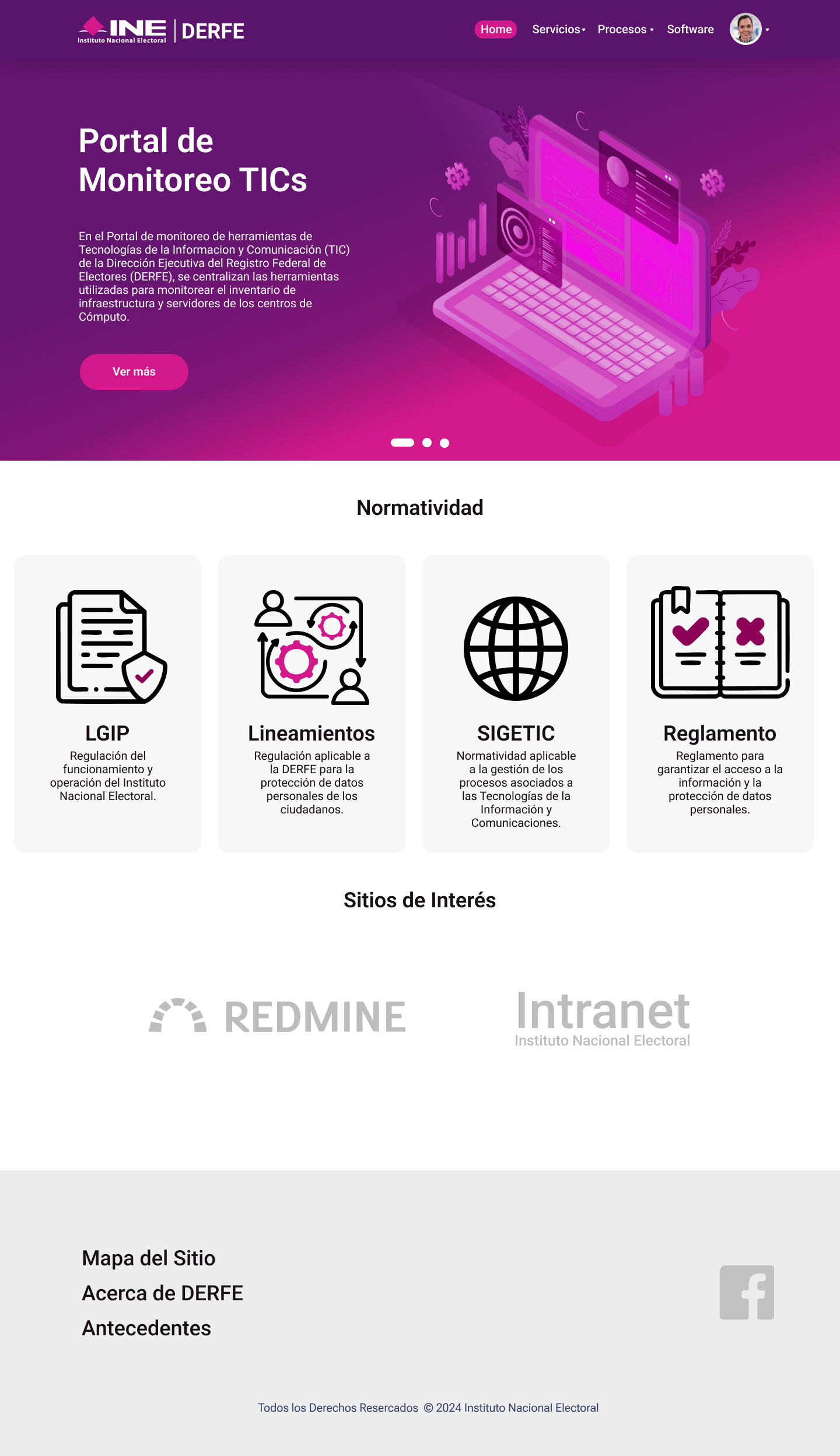
Final Result
Summary:
- Enhance UX Text: Simplify and clarify the language to make the content more accessible and user-friendly.
- Reorganize Information: Streamline the structure of the content for better flow and easier navigation.
- Introduce Interactive Design: Implement interactive elements to engage users and improve the overall experience.
Due to contractual obligations, this screen has been blurred, and certain information will not be displayed.


About
Projects
Illustration
DERFE Portal Redesign
Client: DERFE – Dirección Ejecutiva del Registro Federal de ElectoresRole: UX/UI DesignerYear: [Add Year]Tools: Figma, Adobe Illustrator, Maze (optional if tested), Miro I was tasked with redesigning DERFE’s internal platform — a government portal used for monitoring digital services — to improve usability, simplify navigation, and bring a modern interface aligned with accessibility standards.
The Challenge: How to refresh the site?
The main page features three separate menus, each with its own set of options and information. While the goal is to offer a variety of resources, the current structure can make navigation difficult for users. The portal description, although informative, uses complex language that might be hard to understand for some users.
Simplifying this text and restructuring the menus could make the portal more user-friendly. Providing clearer, more concise explanations and reducing the number of menus would improve accessibility, helping users find the information they need more easily and quickly. Streamlining both the language and navigation would enhance the overall user experience.
My role
I created the new look and feel, considering design principles and new trends, while incorporating institutional colors to make the website more appealing. Additionally, I worked alongside a Product Manager and a Backend Engineer. After reviewing user feedback, we decided to simplify the menu and highlight the key areas that required greater visibility. The creation of wireframes and the first prototype was completed by 2018.
Wireframe
Final Result
Summary:
- Enhance UX Text: Simplify and clarify the language to make the content more accessible and user-friendly.
- Reorganize Information: Streamline the structure of the content for better flow and easier navigation.
- Introduce Interactive Design: Implement interactive elements to engage users and improve the overall experience.
Due to contractual obligations, this screen has been blurred, and certain information will not be displayed.